Research & Startegy
So What is it like to hire a contractor?
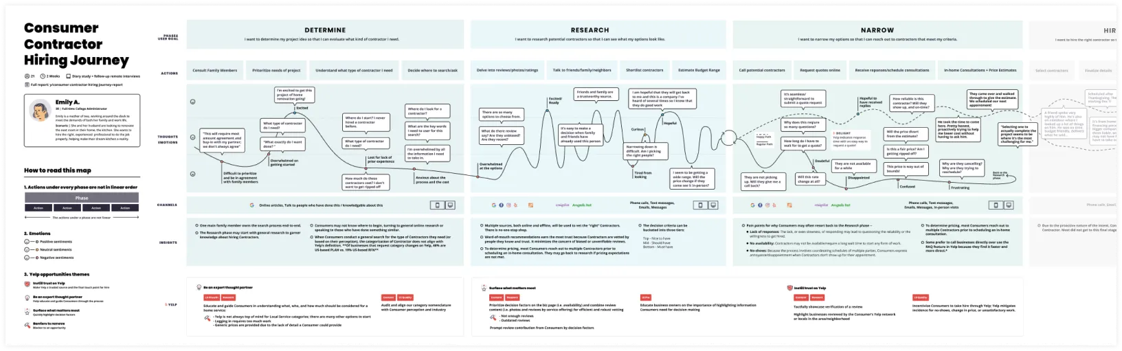
We at Yelp have not been immersed ourselves in the home and local services space. To gain a foundational understanding of the consumer experience, I partnered closely with our UX researcher to conduct a longitudinal study on the hiring journeys of 21 homeowners. After hours of synthesizing diaries, videos, and interviews, I created a user journey map highlighting the major consumer pain points and product opportunities for the local services sector, which sparked product initiatives at multiple stages of the funnels. It also helped underscore a research-inform culture in the cross-functional teams focusing on home services and encourage every team member to develop more profound empathy with the consumers we are working to serve.
Tailoring the Search Results
From a strategic standpoint, it was clear from the user research that Yelp needed to create a diversified search experience for home services as consumers are in a different mental model when searching for a mover or plumber, compared to looking for the most popular boba place in town.
Within the hundreds of categories in the home services industry, there are also many differences. For example, while consumers want to find the closest auto repair, they might not care where the plumber can fix a clogged drain located on the map. Early on in the project, the team aligned on focusing on one category (we chose movers) to solve the user problem very well, instead of doing an okay job that works for multiple categories. On the topic of scaling, I love the perspective of Airbnb’s Brian Chesky: “It’s better to have 100 people [who] love you than finding a million who just sort of like you. Build your business one person at a time.”
Problems
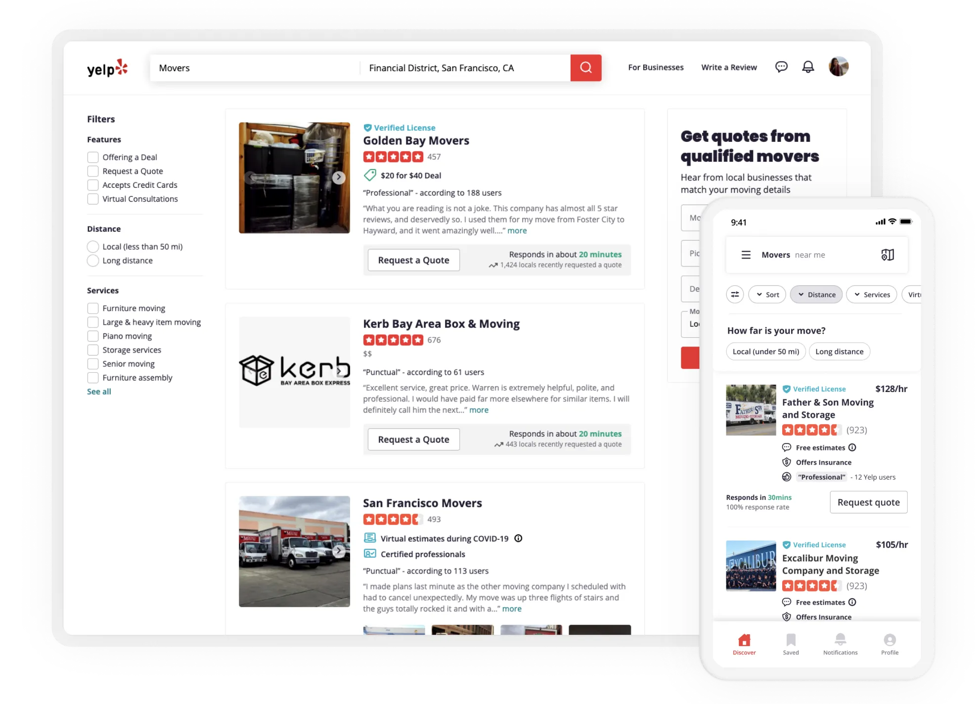
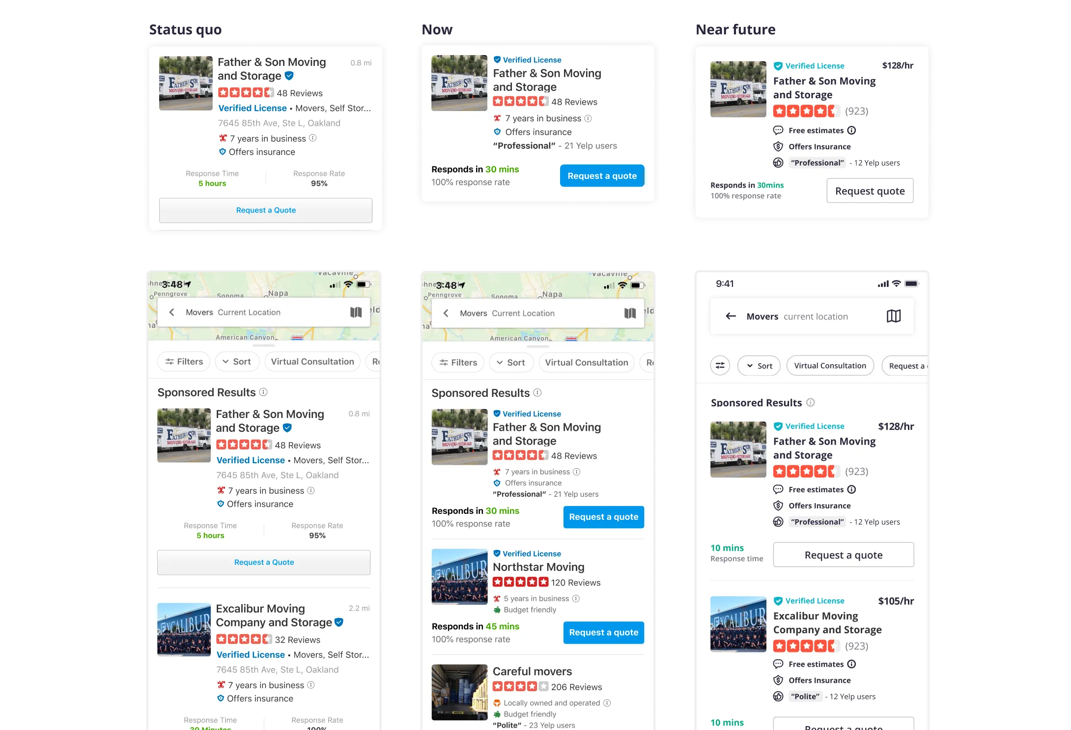
To kick off the process, I started with an audit of our existing design, which has worked very well for the use case of restaurants and coffeeshops.
The existing search results (shown above) fell short on the following aspects:
- Redundant information: from the user interviews, we learned that consumers don’t care about the moving companies’ location. Therefore the map and the service area on the search result cards are redundant. While for restaurant results, the categories serve as supplement information to describe the type of restaurant it is (think tags like Ramen or Bar). This information is repetitive in the home service land because the service category should reflect search queries and filters. If users search for movers, they should be able to expect that all the results are companies that serve their moving needs.
- Lack of decision-critical information: Consumers are sifting through businesses based on ratings, reviews, expertise, and timeliness. However, the review snippet we surface is often times unhelpful.
- Visual clutter: The icon for verified license and its text are separated in two lines, undermining scannability.
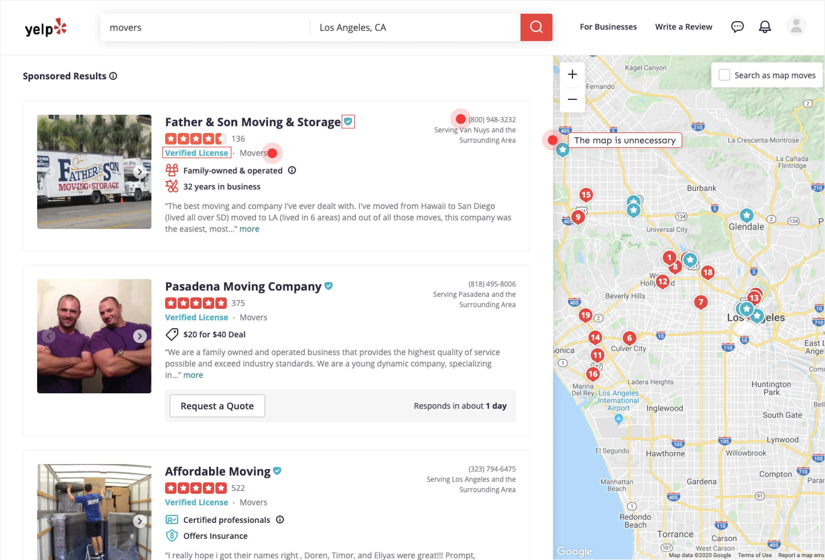
Desktop Search Results
Aside from removing unhelpful information, we also want to improve the cards with relevant information about the business to help consumers’ decision making. The cross-functional team worked closely to brainstorm and landed on these two viable solutions:
- Rich review content is the bread and butter of Yelp - by highlighting keywords that we know users care about, these annotations help users quickly understand the reputation of a business.
- Many users we spoke to express unease about hiring movers because a move is very personal. The new design leverages social proof to earn trust and dispel concern by adding the number of people who have recently requested quotes.
To obtain clean learnings, I worked with the eng lead to sequence the changes into various experiments and determined the decision metrics. The results show a massive win - we see an 8.8% lift of CTR on the mover category and a 5% increase in the number of quote requests submitted by consumers.
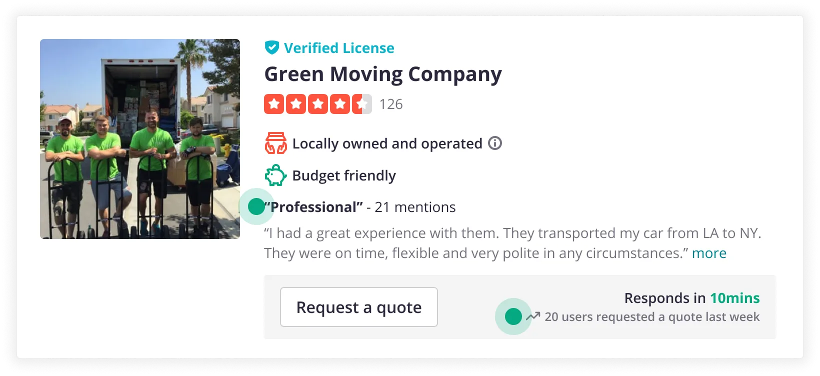
Mobile SERP cards
With limited real estate on the screen and yet-to-be modernized UI, achieving parity on mobile was more challenging. I decided to take an approach to design a “transitional state,” so we don’t delay the launch but, at the same time taking into account the design of the modernized style. Designing with the foresight in mind was vital as we planned to surface other critical decision making information such as pricing and availability.
Impact
Aside from the changed I made to the results cards on desktop, I consolidate and modernized the CTA to further simplified the search results for better scannability and quicker decision making. The CTA layout change was tested in its own experiment and saw a 1.6% lift in monetized connections and a 3.9% increase in the number of quote requests! 🎉