Rethinking Mobile UX
Project goals
- Taking a user-centric approach, I learned through data and user research that the existing search experience lacks guidance and expectation setting for consumers searching for movers. The filter engagement was low, and users felt overwhelmed by the list of businesses to choose from. From our consumer perspective, this project aims to provide a guided and clear search experience that encourages users to refine intent and sets user expectations for the different Request-a-quote entry points.
- From a business standpoint, the new experience would be successful if leading to increased monetized connections between consumers and businesses. The category-level request-a-quote feature on the search page (one that sends the user’s request to a set of advertisers recommended by Yelp) is one of the biggest levers which previously saw very low usage.
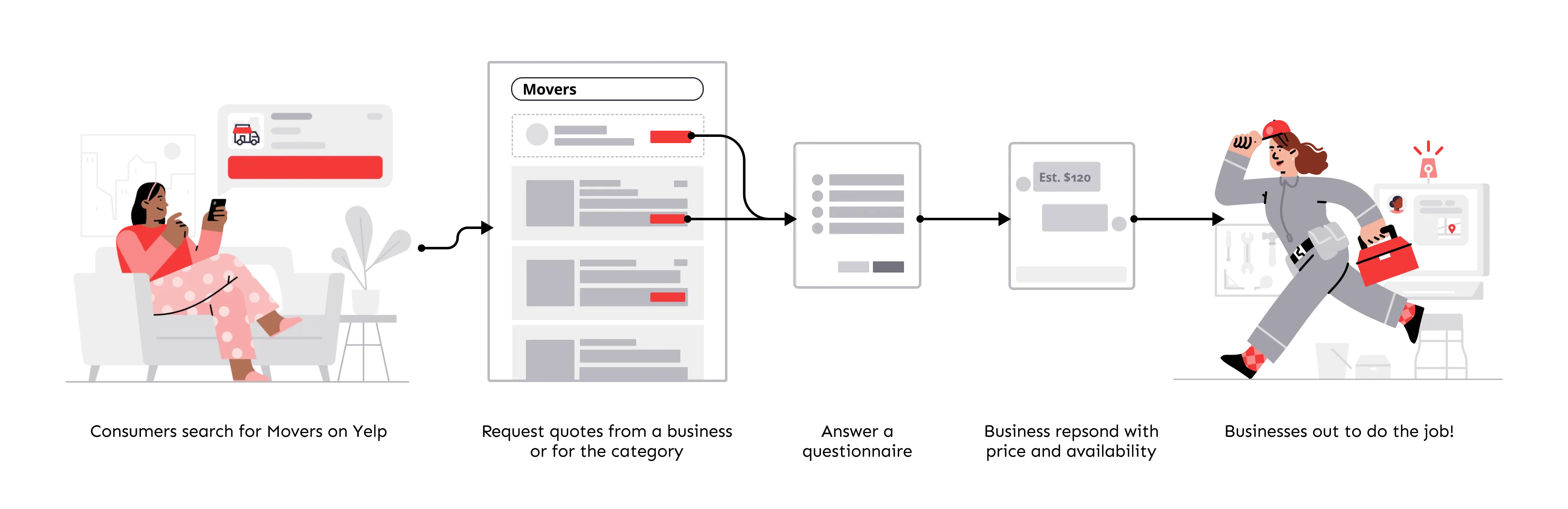
Through a mix of data analytics, iterative prototyping, and concept testing, my goal is to balance the user needs and business objectives and deliver a clear and helpful search experience for consumers searching for movers.
Explorations
As I started exploring different directions, I worked closely with the product and engineering counterpart to understand the different options’ constraints and potential metric tradeoffs. This collaborative process helped tremendously with getting stakeholder buy-in and deciding on the final candidates for concept testing.
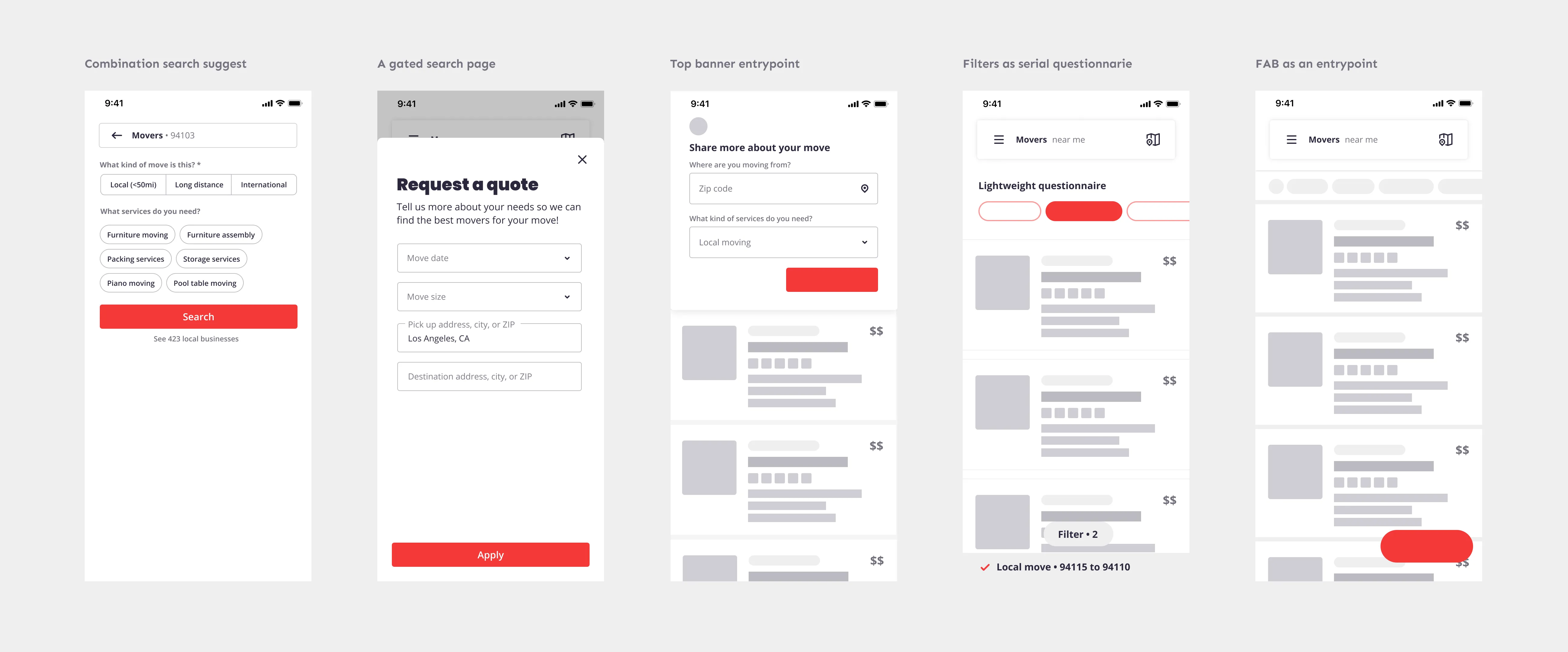
Concept testing
After weighing the pros and cons of the various options in terms of the potential impact on search relevancy, completion rate, monetized leads, and other crucial KPIs, we landed on three concepts for user testing. I set out to develop a research plan and speak to 18 consumers to evaluate the visibility, usability, and expectation setting of the Request-A-Quote entry point.
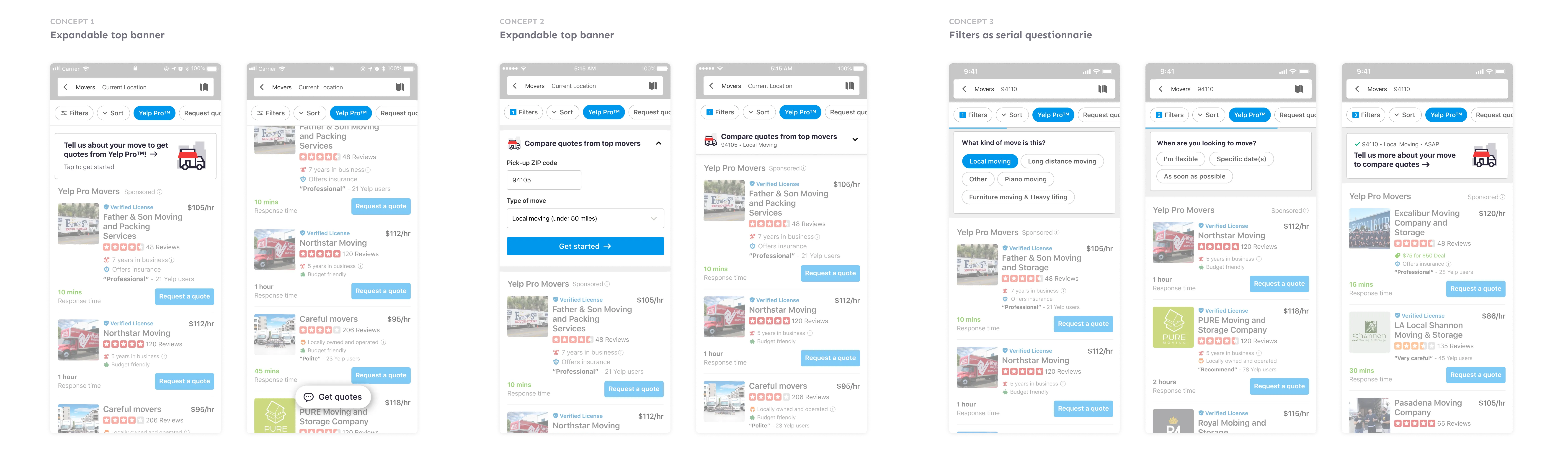
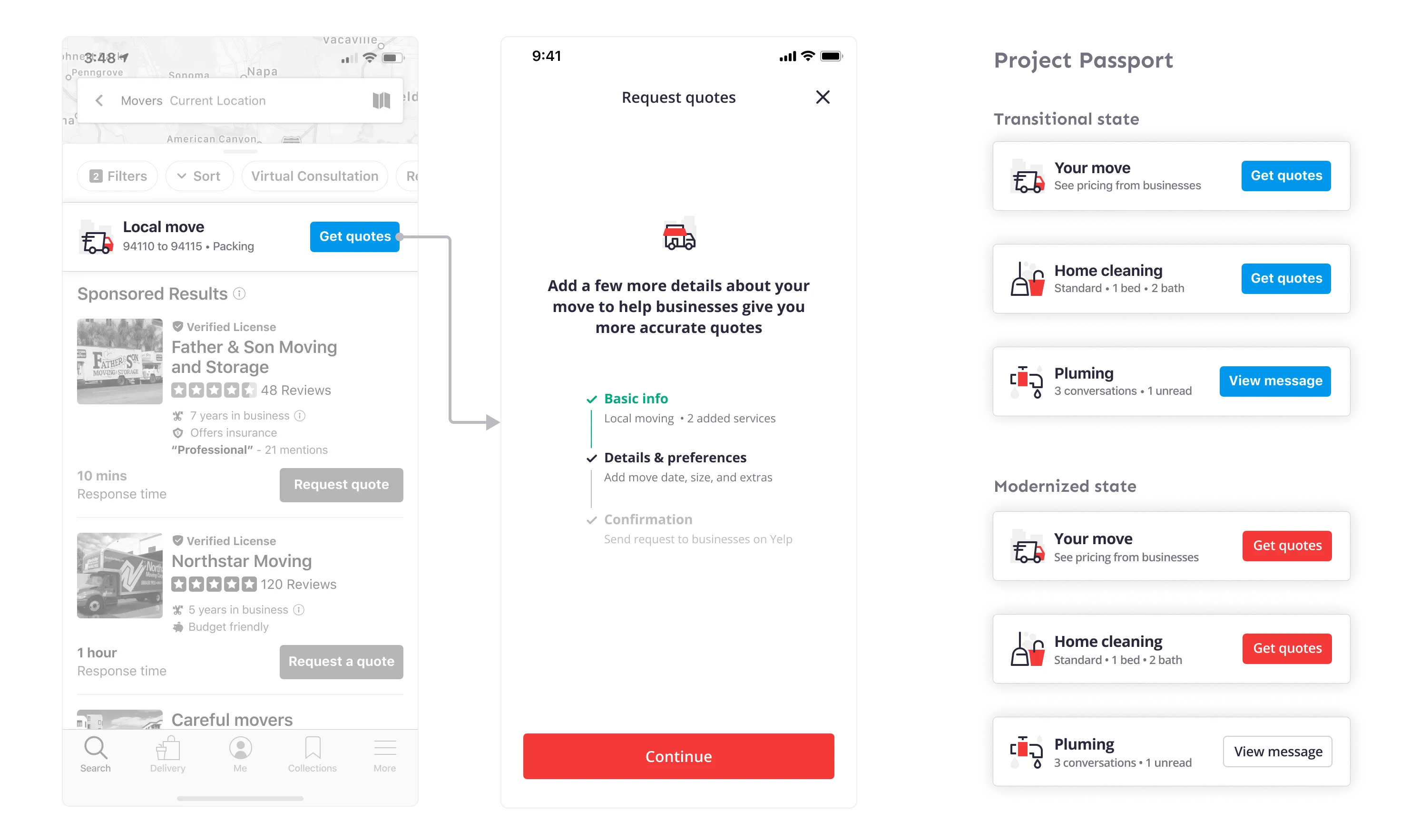
The first concept, which has an enhanced visual entry point that morphs into a FAB on scroll, was rated moderate on visibility, but users reacted positively to the expectation setting of the new start screen of the request-a-quote flow. The second concept ranked highest in terms of visibility as the expanded banner takes up significant space. However, users were disappointed that their inputs didn’t provide feedback. Hence it did poorly in expectation setting. The winning concept was the third, which has lower visibility, decent comprehension, but performed well in expectation setting - users expect the inputs to help narrow down businesses.
Sequencing and Experiments
The concept testings made it clear that users prefer the experience to frontload part of the questionnaire as filters to refine user intent and jumpstart the request-a-quote process. However, the relatively low visibility made us worry whether such a massive technical investment might lead to a much dropoff. As a team, we also feel that making the filter questionnaire sticky could feel obstructive, given the amount of space it could take up on a small phone screen. In the spirit of de-risking and gaining evidence for future product decisions, I combined the learnings from what works well from the concept testing and delivered two variations for experimentation.
The first cohort was primarily based on the winning concept, with a questionnaire serving as both filters and inputs for Request-A-Quote. A floating action button appears when users scroll past the questionnaire to provide an ever-present entry-point.
The second cohort featured a sticky filter questionnaire that is ever-present. Consumers won’t have access to the category-level Request-A-Quote entry point unless they tap through the two filter questions.
For both cohorts, I introduced a new content object to represent the project. We call it the project passport, a recognizable UI component that users carry through their search experience. This helpful component was then reused in other parts of the product.
Empower business owners
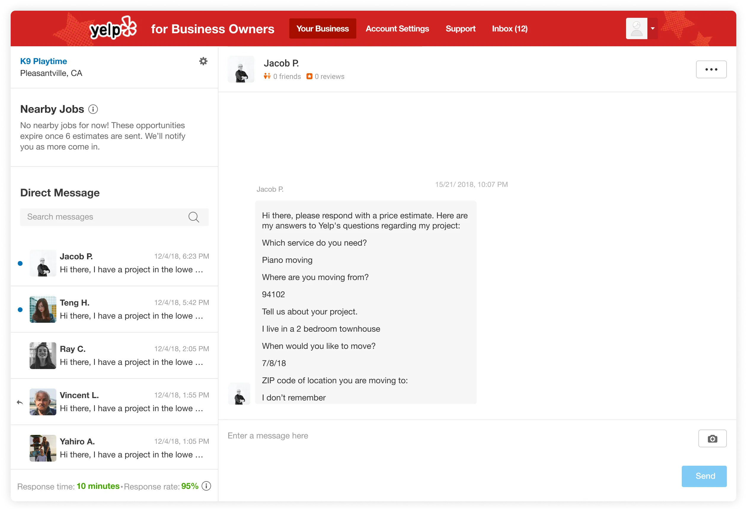
Like any other marketplaces, a systematic approach is vital in ensuring features that benefit one side of the market don’t compromise the other’s experience. On the business owner front, I worked on a new feature that eases business owners’ stress about responding to consumers around the clock, a critical pain point was echoed by many business owners in our user interviews.
The why
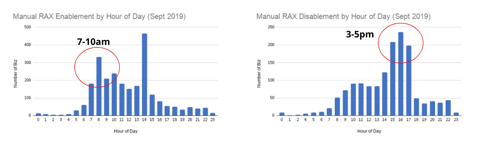
Consumers coming to Yelp can see the response time and rate of a business, and they love the feature. Many users have told us how they like that it gives them peace of mind when reaching out to businesses. However, we learned that businesses feel frustrated that there’s a lack of flexibility in responding to RAQ without hurting their response rate/time on Yelp from user interviews. Digging into the data, we also saw a pattern of business owners turning on the morning’s messaging feature and turning it off around the evening.
Making the Product Decision
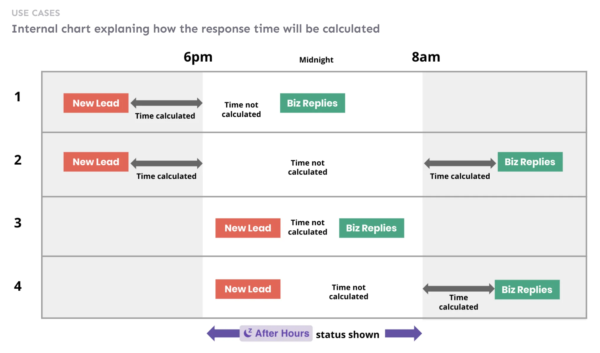
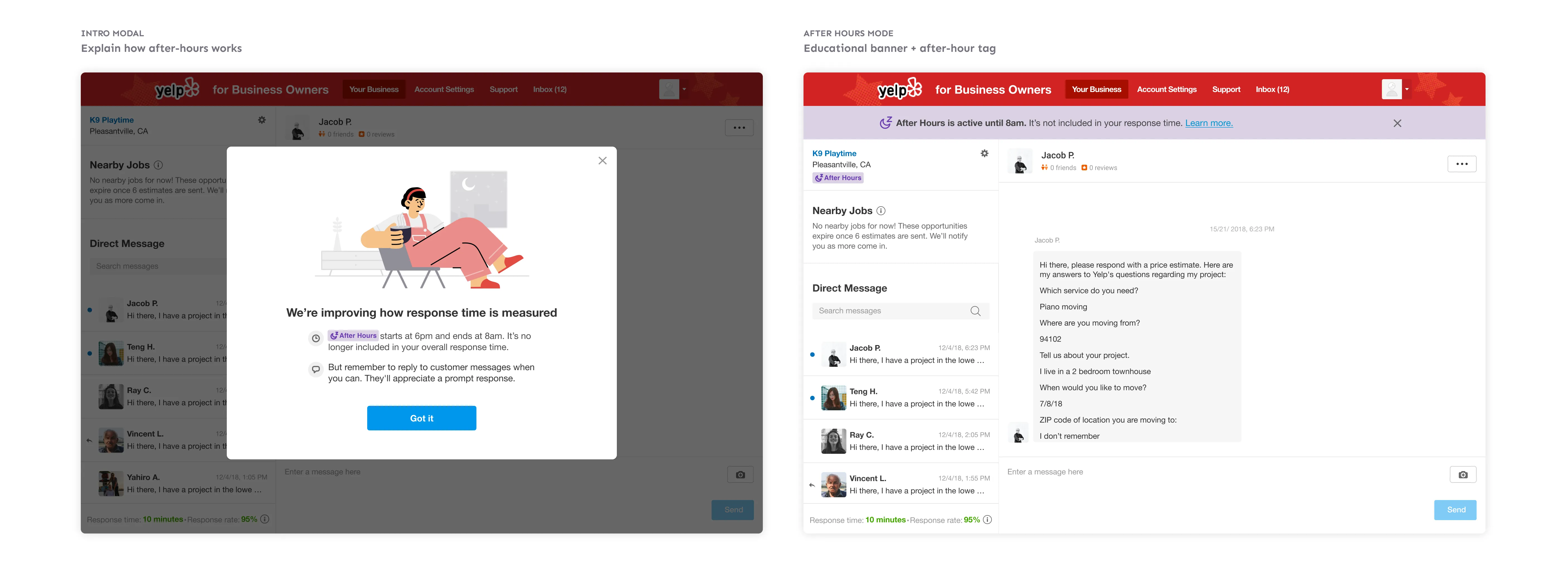
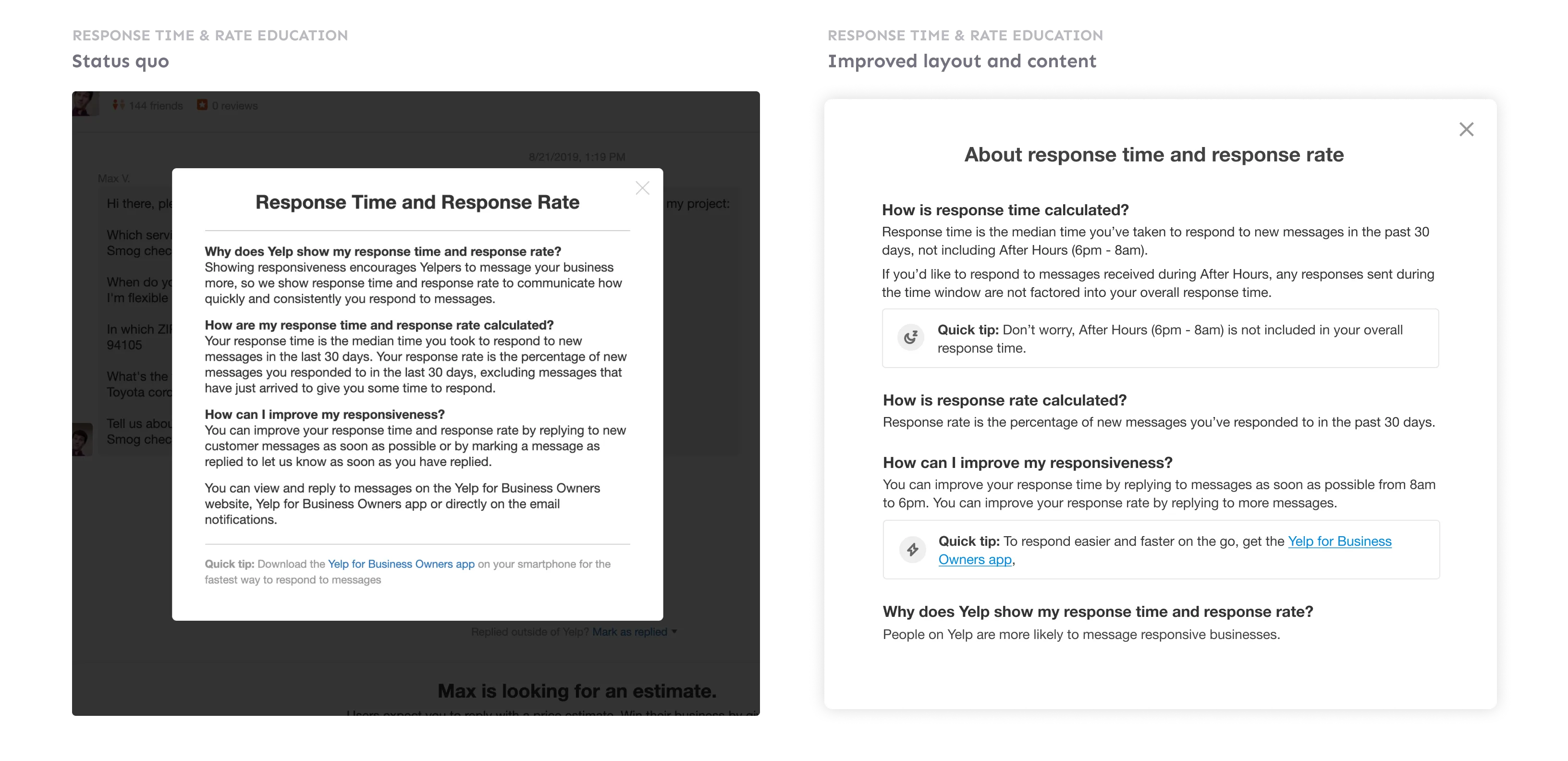
Naturally, we started exploring ways businesses can “snooze” their messaging and quickly turn off messaging. However, we needed to balance the control businesses have and the consumer side experience. Instead of giving businesses full control to snooze off messaging anytime (a feature that might be abused and leads to a poor consumer user experience), we decided to set an “off hours” so businesses don’t need to attend to messages at night when they relax. Practically, the response time stops calculating during after-hours - if a business received a minute before after hours starts and responds the day after right when after-hours ends - the response time will be one minute.
Creating the experience
A branded experience with visual delight
I created a robust visual system on the business owner’s inbox UI to introduce and indicate the new change. Yelp brand’s purple was fitting to tie all the pieces together. On top of that, I also created a custom illustration to add to the human elements. (We were transitioning to the modernized UI, so the illustration is in the modernized style).
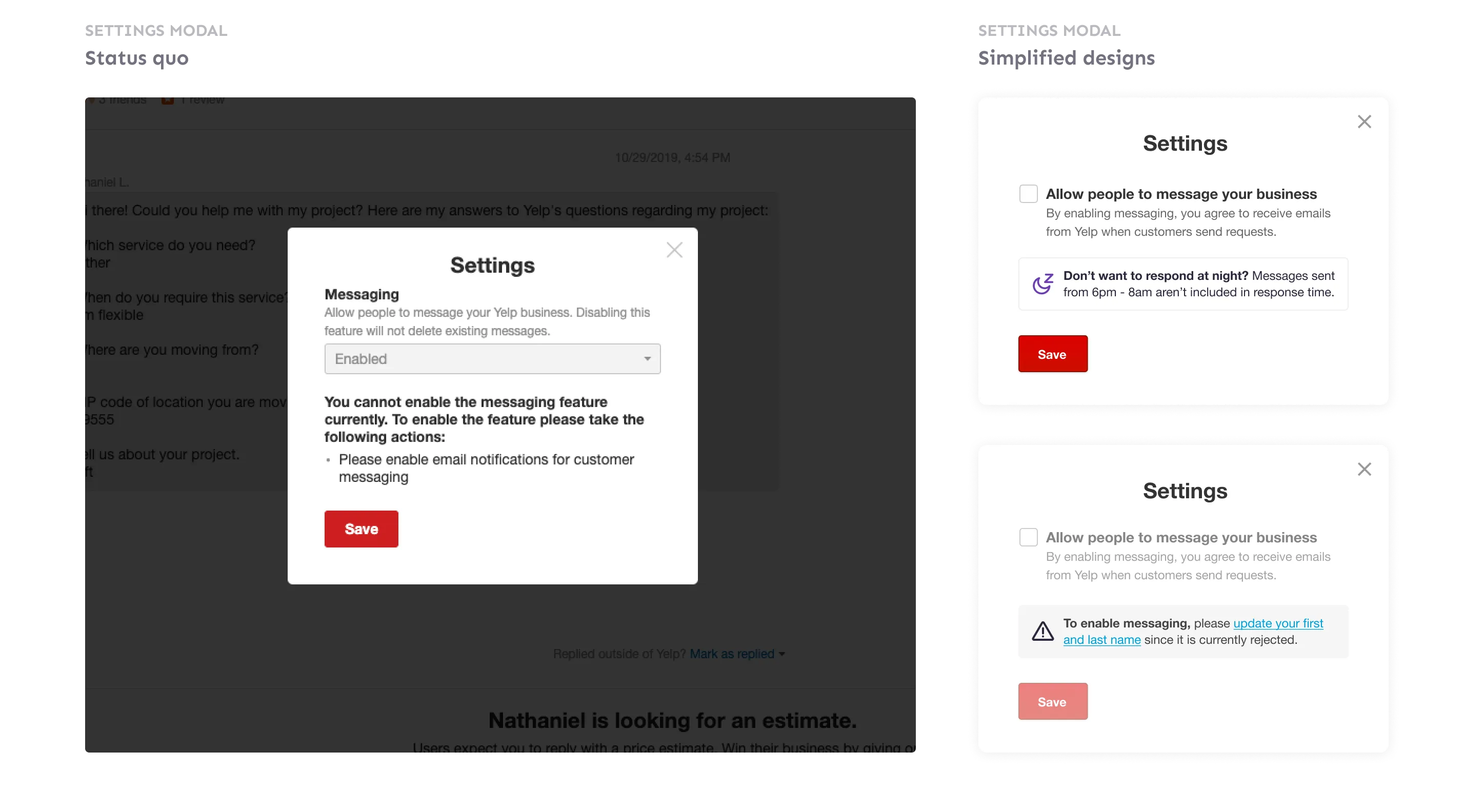
A clearer settings modal
As an advocate for our users, I also use this opportunity to fix the messaging settings - the modal businesses use to enable and disable messaging. The old design was confusing and not actionable, so I simplified that experience and improved the copy.
We rolled out this feature early this year and heard great feedback from business owners that were once very frustrated with the original system.